Optimizing artwork for large format printing
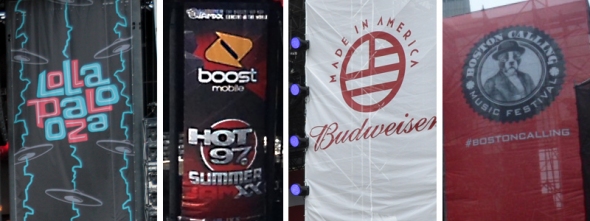
Festival branding printed on vinyl mesh (scrim)
A creative and bold graphic theme can elevate an event into an experience that not only sounds good, but also visually looks just as appealing. Festivals such as Lollapalooza, Hot 97 Summer Jam, Made in America and Boston Calling have created a tight unity between their brand and their performers by using dynamic artwork and cohesive, cross-application graphical themes.
Brainstorming possible ideas, selecting a festival theme, and then executing all of the graphic work for an event can be an impressive task. (As a graphic designer myself, I understand the pains and stress of this process!) The last thing you want is to end up with production issues with your submitted artwork, sometimes only days before your event.
Here are a few things to keep in mind when creating artwork for large format banner printing. Hopefully these tips will help you avoid the fateful, last-minute call from your vendor: “Your file isn’t working!”
1. Software
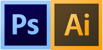
A good graphics program can be your best friend when preparing images and artwork for production. Adobe is a leader in the graphics and media software industry. Two fundamental graphics products are Adobe’s Photoshop and Illustrator. Photoshop is great for working with actual photography and raster graphics (a raster file is composed of pixels). Illustrator, on the other hand, is ideal for creating vector graphics, such as logos and illustrations (vector graphics are created using lines, points and other geometric shapes). Both of these programs are powerful tools in creating designs, and are cross compatible with each other. If you have the budget and skill to use Adobe’s software, I highly recommend it.
2. Lead time
It is best to begin creating your artwork well ahead of your deadline to ensure that you have enough time to work through all of the kinks, revisions, approvals, etc. that you will encounter. Our print shop requests that artwork files are sent to us at least a week in advance to when the finished pieces need to be installed. We (and many other vendors) understand the industry and that things pop up last minute, but your printer will love you if you can avoid late submissions.
3. 300 dpi or higher!
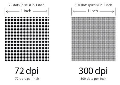
One thing to absolutely make sure you address before jumping into your creative endeavor is your file’s resolution. As a rule of thumb when creating files for print, always set your document to 300 dpi or higher, and make sure your color mode is CMYK. (RGB color is specific to web use, never send a graphic file to a printer in RGB — they will send it back!) 300 dpi (dots per inch) will guarantee a crisp printed image because it contains more pixel data than a lower resolution file (see image below). Avoid printing pains by treating this tip as a mandatory guideline.
4. 1 inch = 1 foot
…most of the time! Typically, large format printers accept artwork in any scale (providing that it makes sense, of course), but using a 1” = 1’ scale just makes figuring out your dimensions easier — easier to translate to the printer, easier to correct and easier to work with. If you’re unsure of what scale to use, ask your vendor before creating your file – production will thank you for it.
5. Let it bleed!
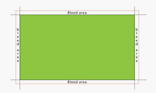
No, this is not a Halloween pun. It is always good practice when creating graphics that touch the edge of printed material to accommodate with a bleed. A bleed is simply extending the part of the graphic that hits the physical printed edge past the artboard, so that production can cut the piece without the risk of losing any printed information. Although this is not required when dealing with large format prints, it’s not a bad idea either. If you decide to incorporate a bleed into your file, a 1” bleed should suffice.
6. Don’t save a .jpg
So you’ve completed your masterpiece, your artwork is approved and you’re ready to go to the printer. …Or are you? File saving is just as important as the creative process in guaranteeing a clean and hi-res output. Hi-res .pdfs or .tifs are 2 file formats that avoid image compression issues that come with saving .jpgs.
7. Submit and confirm
This might seem redundant, but whenever I have had to submit artwork to a printer, I’ve learned to always follow up my submission email with a phone call. It’s too easy to hit “send” on your email, walk away for the day and end up with a puzzled look as to why your scrim isn’t completed by your deadline. Technology is great, but for some reason, email always seems to have random hiccups. Don’t risk it, just pick up the phone and confirm that your file is in the hands of production – and make sure they take a look a quick look at it to confirm it works on their machines.
BONUS – Be mindful of your material
Two of the most common materials that we print on at Mountain Productions are vinyl mesh and solid vinyl. Both produce a great quality print (granted that the artwork is in the correct hi-res specifications), but it is important to note the characteristics of each material. Since vinyl mesh is a blow-thru material consisting of little holes, extremely thin line work in an art file may not produce as well as on solid vinyl. Think of the material you are printing on and plan your design accordingly.
These are basic guidelines that I have (sometimes painfully) learned from working with large format printing. By following these tips, you can get your mind away from worrying about production and focus on the real challenge — the creative process.
Mountain Productions offers design services and custom printed softgoods in any size and shape. Call us today for more information at 570 826 5566.